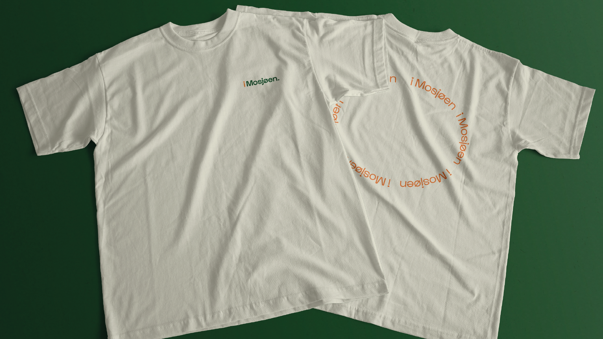
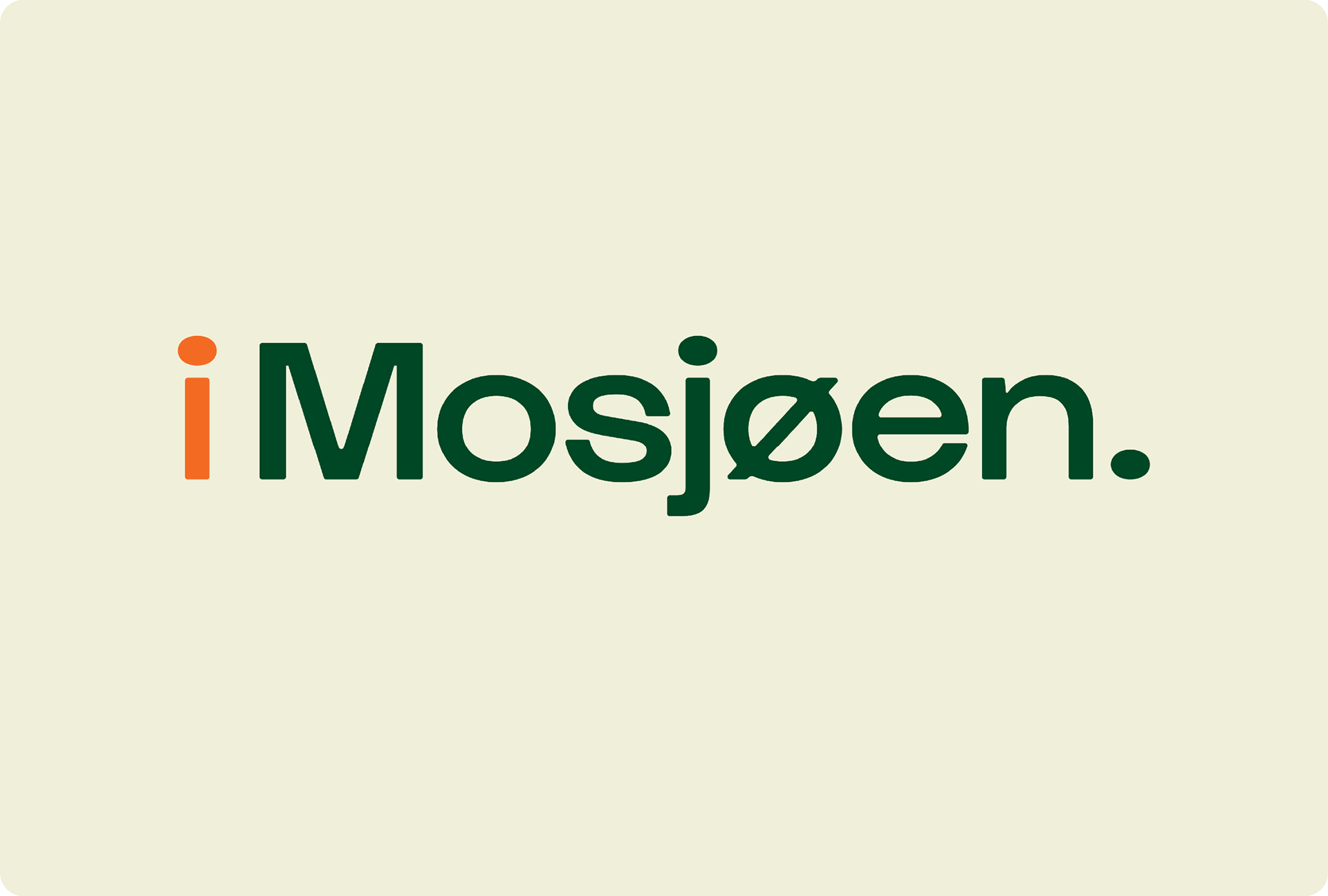
i Mosjøen.
Diciplines
Visual identity
Logo design
Web design
Communication concept
Visual identity
Logo design
Web design
Communication concept
Team
Riktig Spor Mo i Rana
Riktig Spor Mo i Rana
Webpage
imosjøen.no
imosjøen.no
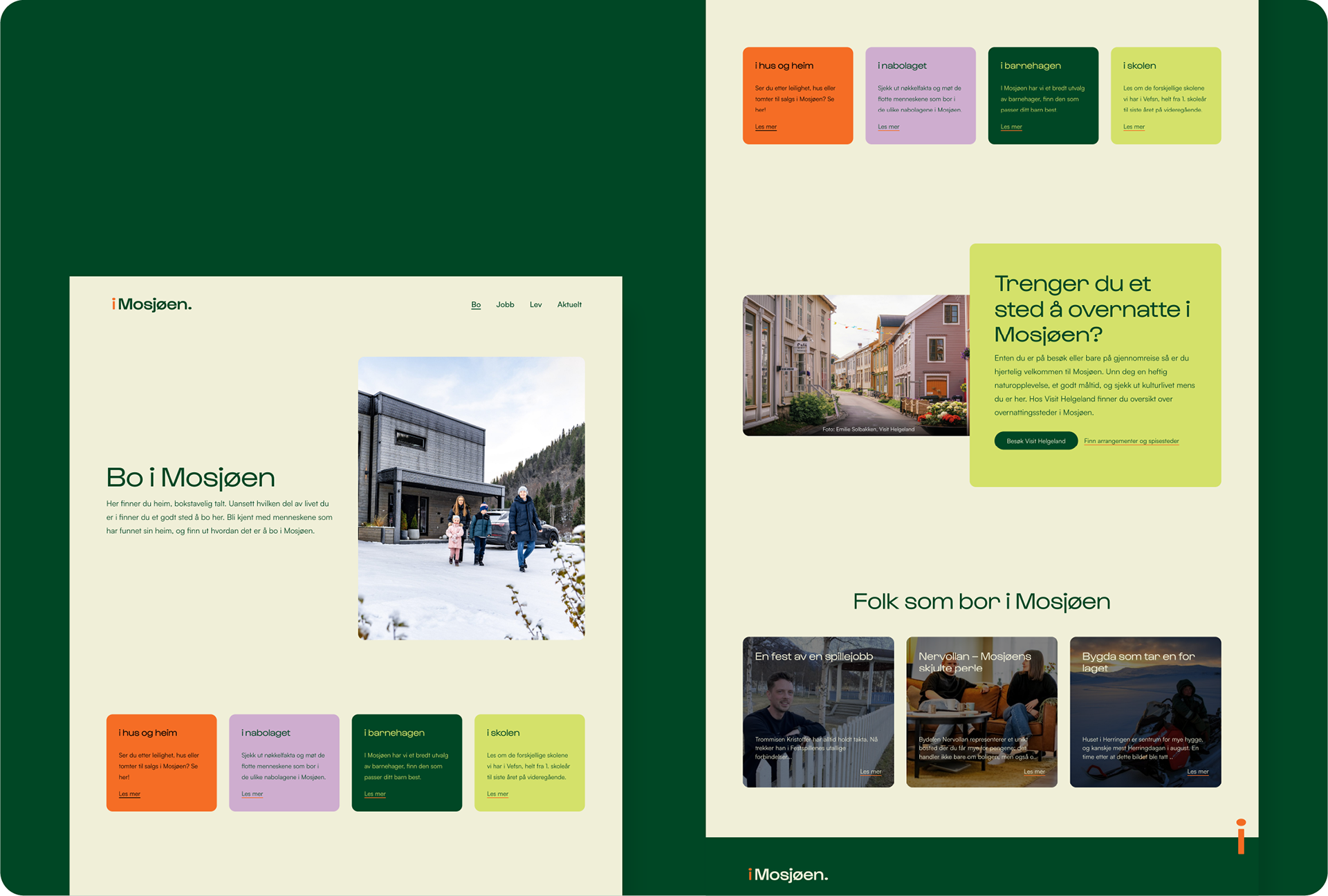
iMosjøen. is a project run by Mosjøen og Omegn Næringselskap, to show off Mosjøen as a good place to live. The aim was to provide a website where the citizens can find all relevant info in one place, and develop a visual identity that captures what Mosjøen is. Down to earth, no fuzz and for the people living in Mosjøen and people looking to move to Mosjøen.
The identity aimed to build a desire to stay, live and work in Mosjøen and Vefsn municipality.
Target audience 18-40 years.
The overall concept is based around the feeling of being a part of, inviting you in and showing you what Mosjøen is all about. By the use of the letter i (meaning «in» in this example) we are able to put the reader into the situations presented.
Example
Barnehage vs. i Barnehagen
(Day care vs. in Day care)
Barnehage vs. i Barnehagen
(Day care vs. in Day care)
As shown in the example above, you are invited in and put in the situation, instead of having a distanced relationship to a word presented.
This is where all the windows and shapes comes to play, both on the webpage, as well as in social media. The use of the dot over the i is a way of «inviting you in» and showing you what is «inside» Mosjøen.
The «i» itself is a representation of the warm and welcoming «Mosjøværing» (a person from Mosjøen), showing you their home, and inviting you in to be a part of the good life in Mosjøen.
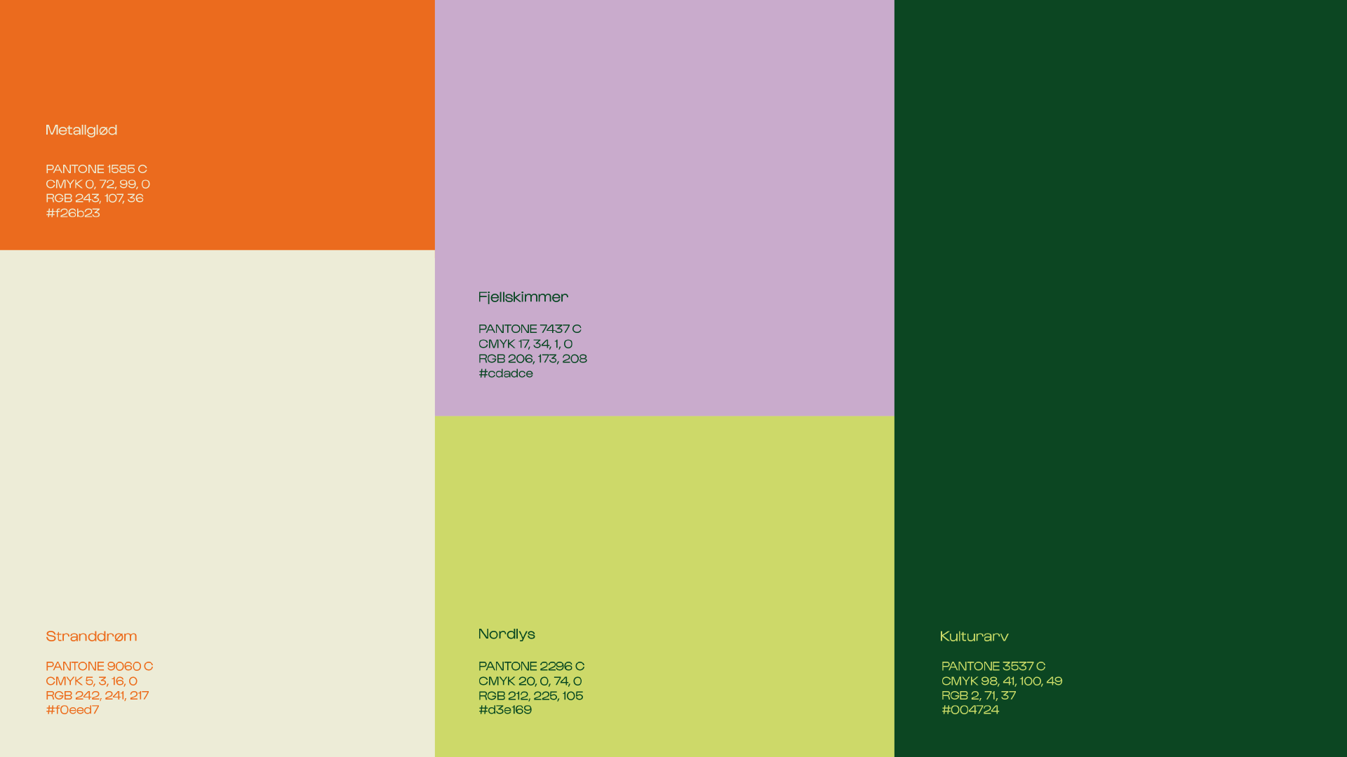
The colour palette is inspired by Mosjøen, and the nature surrounding the city.
From the deep green inspired by Nordlandsbunad to industrial orange and northern lights. The palette is young and fresh, and brings forward some of the most important parts of what Mosjøen is, and has.
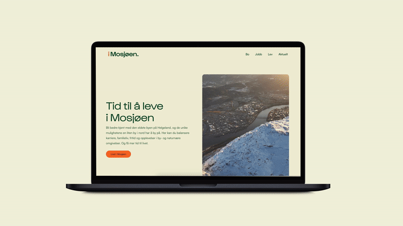
Web page preview
Web design
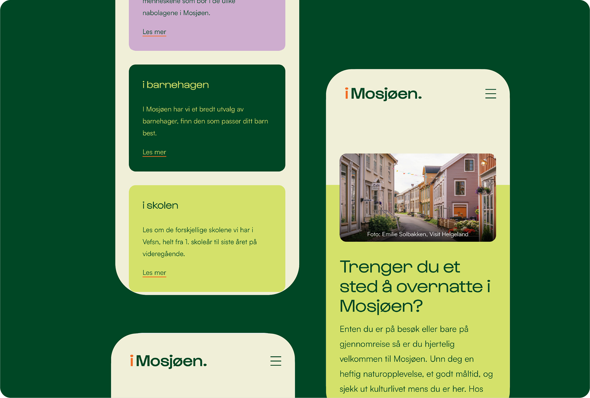
Web design for mobile
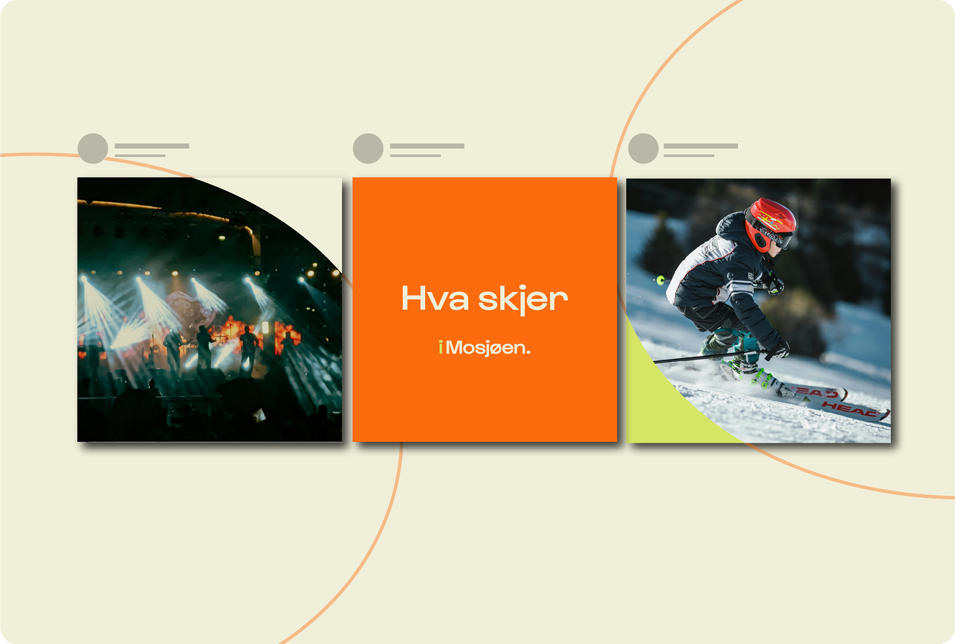
Example of templates for social media.